Robeco
Robeco is an investment company for institutional and consumer investors. I joined just before the COVID crisis hit the Netherlands. While working from home, I was able to establish a remote routine for testing our prototypes and designs. Users are now the foundation for all design decisions made for the platforms.
My work was everything from optimizing the current website to making complex (financial) issues understandable.

My Responsibilities
UX Research & Design
Interview customers, Wireframing, Prototyping, UX/UI design for alle tests
User testing
Running remote A/B test, Setting-up & conduction qualitative user tests
Product & Visual Design
Visual design for campaigns, A/B tests and new features
Change management
In an originally technic driven organization, UX has now its own place early in the process
SOME OF THE SUCCESs
14% uplift
More "add to cart" for main task of selecting the desired fund
Remediated 100.000 clients
Due to government regulated KYC policy we had to run all clients trough a vet process. It included on and offline service design
Implement design thinking in daily workflow
Redesigned category and product pages. Redefined navigation patterns
As more inexperienced people began trading, we wanted to update our fund selection tool. Clients were having difficulty selecting the right fund, and our filters were often overlooked and unclear
I conducted user interviews and ran a quick usability test to confirm where users got stuck. I proposed a solution to reduce the number of funds without relying on the unclear filters. I collaborated with an external partner to quickly develop the solution.
-
Researched user flows and conducted interviews
-
Created paper prototypes
-
Developed test cases to assess the feasibility of reducing the number of results
-
Designed the visuals
-
Developed and implemented the feature on the website"
The result
14% More "add to cart" for main task of selecting the desired fund
LITTLE MORE
DETAIL


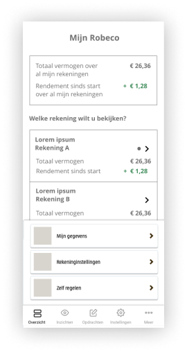
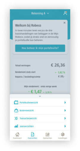
UX research and information architecture to determine the client portal navigation structure
When redesigning the (mobile) client portal web-app I was responsible for the navigation structure and flow. I ran card sorting sessions for site structure and naming universal labels.
This is how we fixed the problem
-
Run card sorting sessie
-
User test navigation structure
-
Test different design patterns
-
Implement best design
The result
Revamped navigation structure


